When I started work on a new feature for a 10-year-old application I knew it would be a challenge to keep the design consistent. The app had been built by different teams over the years, which led to many different implementations of similar patterns. For example, there were (at least) five different implementations of the same primary action button.
We couldn’t create every pattern for this new feature ad hoc if we wanted to deliver quickly; many patterns would be reused, and we needed to document their usage to avoid wasting time reinventing them. I decided to create a style guide for these reusable design patterns. I took this one step further by documenting these patterns in a way that would eventually inform a larger pattern library for the entire application.
Client market: Requirements Management
Role: Research, UX/UI design
Tools: Sketch, InVision
Timeframe: Feb 2018 – Jan 2019
I started working on the style guide after we had created high-level workflows and wireframes that outlined the general architecture of the feature. Doing so earlier would have resulted in time wasted on detailed design changes while the high-level design plan was going through massive changes.
In this case study, I’ll walk through my process for creating and maintaining this style guide, which acted as a living document that informed design decisions throughout the process.
Audit everything
We needed patterns that looked and worked like the rest of the app. Consistent interactions would make the new feature familiar, and therefore easier to learn. So, every interaction decision started with an audit of the existing application.
One of the first examples of this was the primary and secondary buttons. There were many variations of these throughout the application. I took screenshots of each state and noted the button’s location and usage. From there, I worked with the UX team and front end engineers to choose a style for the interaction that would best meet user needs.
Most often, we used an existing style. The engineers would decide if the existing code could be used as-is, needed to be refactored, or had to be built new. Sometimes, none of the styles were a great fit and we would create a new one, but this was rare as so many of the interactions we needed existed in some form in the app.
Define information architecture
The primary interaction pattern of the new feature was a table of data that the user could customize, search, and filter. A similar data table existed in two other areas of the application. I compared these, noting the common areas; both had a menu with some shared controls (like exporting, creating, and deleting.) Also, both used panels on the left of the table to show high-level data. Both of these interactions were used in the final design for the new feature.
Consistent information architecture would help users learn the new feature quickly because the language and location of common features (such as search, filter, and export) would already be familiar.
Define typography, colors, and spacing
When creating the visual language for the app, I started with the underlying elements that would tie all of the other patterns together; typography, color, and spacing.

Finding a balance between the existing and new patterns required some trade-offs. For example, the existing application didn’t use a grid system. When we chose to use an 8-pixel grid, it meant that some of the buttons would be a slightly different size than their cousins in other parts of the application. Also, the color system was designed so that the contrast ratios were WCAG compliant, which made some of the colors slightly different.
The goal wasn’t to support the myriad of existing styles, it was to define a foundation for all styles in the application going forward. The team agreed that the benefits of creating reusable patterns would outweigh any confusion caused by these slight inconsistencies. To test this assumption, we would later check if these changes were noticeable during a usability test. None of the users we tested with ever noticed these differences.
Define common language rules
We started with a strong foundation when defining language rules; our UX writer had previously compiled a language guide for the application. This included usage guidelines for some of the interactions we were defining. We used this to inform all of our language choices in the style guide.
To help our team speak the same language as feature-specific language changed, I worked with our UX writer to develop a glossary. I kept this updated throughout the life of the project. When the feature was released, this guide was used for developing the help documentation.
Define interaction patterns
I worked with the UX and engineering teams to set basic standards for the interactions in the style guide. Each pattern had to:
- Be WCAG 2.0 accessible
- Be built with reusable code and design specs
- Fall in line with Jakob Nielsen’s 10 heuristics, where applicable
- Follow our language guidelines
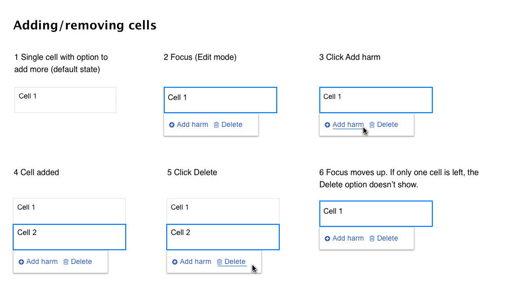
Every pattern was documented with detailed micro-interactions. These helped the engineers quickly build these patterns as all the states were defined before they started work. They also helped us uncover missing pieces, such as error messages needed, interaction states, etc. QA also made heavy use of these.

Outcomes
The engineers working with the style guide were happy with the increased efficiency it brought the team when creating new patterns and communicating changes to existing ones. Managing change was a highly-collaborative effort; we all worked together to keep the styles in the codebase and the style guide up to date.
I updated the style guide and the glossary in tandem for the duration of the project. Each time we learned something or tweaked styles, these were updated. This helped us stay on track as the story changed over the year it took to complete this project.
Finally, the style guide helped with my efficiency. All of the patterns were Sketch symbols that I reused and always kept updated in the spec. Because of this, I was able to quickly generate new screens for usability testing.