A new user onboarding workflow to help students, counselors, or parents start the college application process.
Problem
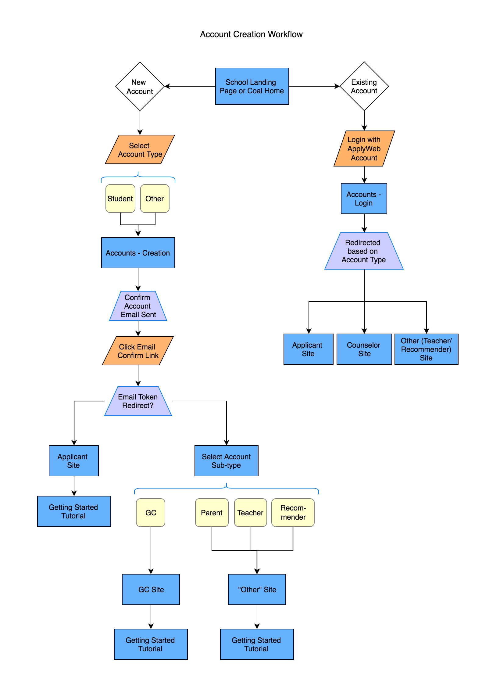
Users who support the college application process, such as parents and guidance counselors, were having trouble selecting the right account type when signing up for the platform. We determined this by analyzing help requests that came in after we implemented the first design.
Client: College application software company
Role: UX/UI designer
Tools: Sketch, InVision
Date: Late 2016
During the onboarding process the user was asked to select their account type from a list that included:
- Student
- Counselor
- Mentor
- Recommender
- Parent/Guardian
- Teacher
- Other
There was no additional explanatory text to help the user choose the appropriate role.
Solution
We were presenting too many choices. Looking at the list again, we had two types of users; the student, who would be doing most of the work entering data, and a support role, who would be viewing their application to help answer questions.
I broke down the tasks so that the user would be asked to select one of those two choices first. Then, if they were a support role user, they would be asked to choose whether they were a counselor, parent/guardian, recommender, etc.
Fewer icons for more clarity
The old UI (not shown here) displayed a unique icon for each sub-role for support users next to the name of the role. Users found these icons difficult to interpret – the distinction between teacher and counselor was unclear, for example – so their only real effect was to increase visual noise on the page. So I ditched those in the new designs, and instead added short descriptions to the Counselor and Other roles to help clarify those choices.

Outcome
Usability tests showed a reduced error rate on signup. There were also fewer Help Desk requests about the sign-up process after we implemented the new workflow.