In this case study I’ll talk about how we updated a payment service to make it flexible, modern, and trustworthy.
Problem
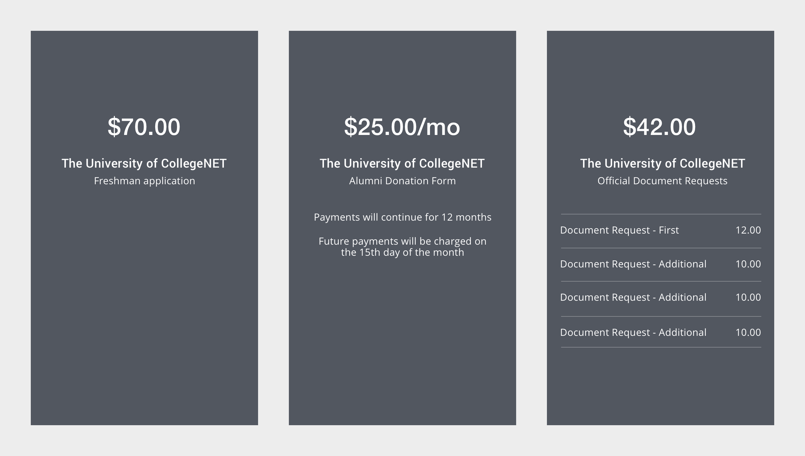
The existing payment service needed some changes to make it more flexible because it would be used to accept payment from many different products. And it needed to display different types of payments to the user including single or multiple payments, and repeating payments.
Client: College application software company
Role: UX/UI designer
Tools: Sketch, InVision
Date: Late 2016
The existing payment service also looked out of date because we had updated the look and feel of our college applications, but hadn’t touched the payment service. They did not look like they were part of the same ecosystem, so navigating from application to payment a jarring experience, which reduced the user’s confidence that they were sending their money to the right place.
Solution
I designed a modern (for 2016) look that used similar typography and layout as the recently updated college applications.
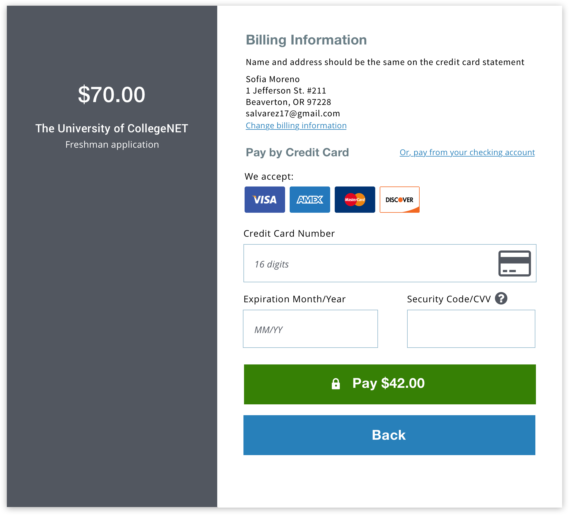
The left panel holds the invoice information. I created flexible templates for this section to allow for different types of payment information.
On mobile, the left panel moves above the payment form (not shown). The old UI did not work well on mobile, and we knew many users were applying to college on their phones or devices.
We made the new experience look like it was connected to the source of the payment request. After the change, we hoped that users felt more confident that they hadn’t been redirected to a scam site as they finished their college applications.